THE STRENGTH OF A CONCEPT IN A CORPORATE LOGO
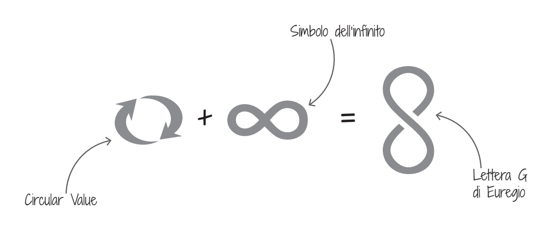
Circular Value expresses the institutional mandate of Euregio+’s commitment to the promotion of financial investments from the territory in favor of the territory. Stakeholders have since ever believed that generating Circular Value supports healthy and exponential growth with guaranteed overall satisfaction.
The Concept of Circular Value expresses our strategic intention to highlight the positive aspects of investment management for the benefit of our territory.
A dynamic, innovative, and solid concept that is implemented immediately but with a strong impact on the future.
It offers as a whole, the opportunity to link the name of Euregio to the territory, the local authorities, and investments in a circular value chain that touches all players.
The circular concept communicates the change towards a clear direction: to seize today the opportunity to create a value that combines profit and purpose.
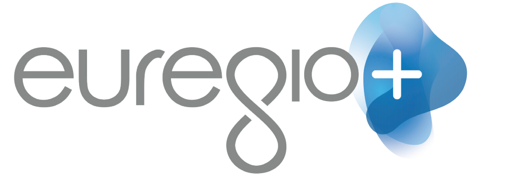
The value of our brand: Euregio+
Tradition and innovation for the new brand, Euregio+ that encloses in a name its roots in the territory, its wealth of culture, values and partnerships, and a strong desire to look beyond our borders.
The symbol + is the extreme synthesis to represent a positive approach to the market and to our customers; it is to be seen as an element of infinite conjunction.
Concept Design
Maximum attention was directed to the design of the logo in order to create a symbol that could represent the institutional values to be conveyed. Simplification and creative stylization are the differentiating elements of a solid institutional communication with our well-defined and distinctive values.
The project foresees the enhancement of two key elements that express our brand’s value:
1. The “+” as a positive universally recognized element, specifically associated with finance and the combination of several elements
2. The creative re-elaboration of the infinity symbol that represents our circular value approach
Graphic element: construction
The graphic element on which the ‘+’ rests wants to emphasize the concept of movement, we therefore refer to what expressed by the logo. Movement also meant as the ability to adapt and “change shape” according to both direction and needs.
Hence, the union of three irregular elements with different shades of color that overlap makes up the symbol.
Note that the final element indicates the direction to the right: that of the future.
Corporate Logo
That is how our Corporate Logo was born